Tuesday, September 29, 2009

On the Grid

.
The National Parks: America's Best Idea, the six-episode Ken Burnsian documentary by Ken Burns, began airing on PBS this past Sunday night, and I thought I would take the opportunity to post about one of designer Massimo Vignelli's best ideas: his 1977 template for the national park system's brochures. Vignelli himself has said it is one of his all-time favorite works – and that is really something, considering he is responsible for New York's MTA subway map and signage, Knoll's graphic identity system, and with his wife Lella, classic designs for Heller, among other iconic designs across a variety of disciplines.

Vignelli's design utilizes a "unigrid" template to maintain consistency across brochures for the almost 400 parks in the national parks system.

The unigrid in action.


The most effective, instantly recognizable part of the design is the black bar across the top with the park's name in very clear Helvetica (a signature Vignelli move, and an echo from his earlier designs for Knoll and the MTA). I always look forward to seeing what image each park chooses, and how they crop it in the space provided. The Ozarks brochure with the watercolor of people canoeing on the river is my favorite, of the parks I've visited. (Click to enlarge.)

In recent years I think attention to detail has slipped a bit on some of the brochures – for example, above, you can see that someone decided to get creative and make the word "Dinosaur" bigger than normal on that brochure (because, you know, dinosaurs are big). Though, now that I look at it, maybe that's the size it was meant to be originally. It sits nicely in the space, if there's no tagline required.

One truly disturbing development is the fact that many of the parks have replaced Helvetica with what looks to me like a medium-weight Verdana (?). For non-designers: this is the same problem presented by Ikea switching from Futura to Verdana – but far more serious, because the parks belong to us, whereas Ikea belongs to some Swedish guy.

Verdana (and Arial too, which might have been a more logical misstep) were designed as low-memory screen fonts, and – even the typographers who invented them would probably agree – are not meant to be printed on anything that matters.

Still, the main elements of the system are in tact, and as the John Muir of printed ephemera, I'm no less excited to get a brochure each time I visit a park. I just prefer Helvetica. Used in the way Vignelli intended it, it emanates modern civic-mindedness – it reminds us on a subtle level that the parks are ours, that we as a people, through our government, own these majestic places and reminders of our history.


More info:
Read about Massimo and Lella Vignelli at AIGA's website and at Vignelli Associates. Plan a visit to your national parks at nps.gov; check out Ken Burns' documentary series The National Parks: America's Best Idea on your local PBS station and at pbs.org.

Image of the Day

.
Photograph of a photograph by Skye Parrott, from a recent issue of Abe's Penny.

Skye Parrott is creative director of the bi-annual arts and culture journal
Dossier; Dossier's editorial director, Katherine Krause, wrote text in response to Parrott's images for the September
Abe's Penny. Read my interview with the founders here.

Monday, September 28, 2009

Final Cut

.
Images from UNCOVERED: Photographs by Thomas Allen (Aperture, 2007, forward by Chip Kidd). Signed copies are available directly from Foley Gallery.

Foley Gallery in New York – a small but consistently great exhibition space, always one of my favorites – is currently showing the third solo exhibition of photographer Thomas Allen.

Allen precisely cuts and juxtaposes the covers of vintage pulp novels, and then photographs them; the resulting images have been featured in Harper's, The New Yorker, GQ, Esquire, The New York Times and elsewhere. This show, Epilogue, signals the end of the series.
Allen’s final foray finds the characters that he has so effectively brought to life entering reluctant tableaux that heralds their demise. Whether it is death, the end of love, a showdown or a last curtain call. His unmistakable talent for creating the illusion of 3D with deft cuts and crimps allows us to see cowboy’s guns floating in mid air, spacemen taking their last gasp and an aerialist taking a death defying plunge.

Inspired by the View-Master and “pop-up” books from childhood, Allen became interested in combining these viewing experiences with his adult interests in pulp fiction paperbacks as still life subjects. In this new series of work, the narrative is reduced to the final scene, often the scene of the crime. How and why these characters have come together in their drama is up to us to decide.
Epilogue is up through October 10th – definitely check it out if you're in NYC. More info and images at foleygallery.com

Image of the Day

.
Two things I love about this photo, backstage at Gucci:
1. The shadows on the wall. Gray can be very complex.
2. On the model nearest the camera – the structure revealed through the back of the jacket is really modern and a good design inspiration on many different levels.

Visit The Moment, the blog of
T, The New York Times Fashion Magazine, for more from the Milan fashion week photo diary of Sofia Sanchez and Mauro Mongiello.

Meanwhile in the Nerdery

.
Some things I found Saturday morning at the Seattle Public Library's semi-annual book sale, all $1 each:

An 86-minute lecture by Rem Koolhaas on his brilliant design of the central branch of the public library.

Architect Victor Steinbrueck's collection of drawings of Seattle neighborhoods and character ca.1973.

This spread is about houseboats (click to enlarge).

This is kind of a cheapy paperback but the page layouts and typography are really nice, and there are a lot of interesting photos of Picasso messing around at home and in his studio. The dude just refused to put a shirt on but his swagger made it work.

First edition, standard issue.

Remember the special version of Shalamar's "Second Time Around" that played on KJR when the Sonics went to the playoffs again in 1980?


Click here


Sunday, September 27, 2009

Dry Drunk Emperors

.
Been meaning to post this for months. Drunk History:


See also: Volume 2.5

Volume 3:


More:
Volume 4 with Paul Schneider
Volume 1 with Michael Cera

Saturday, September 26, 2009

I Guess You'd Call Me a Knight

.

Dating video montage by smithy00101 via the entire www

Friday, September 25, 2009

Whether a Jukebox is Sadder Than a Coffin

.
"Funeral - St. Helena, South Carolina," 1955.
Photograph by Robert Frank, from
The Americans

I have posted several times about Robert Frank, so I won't go on and on about him now, other than to say that for people who are interested in photography, Looking In: Robert Frank's The Americansthe new retrospective that went up this week at the Met – is a must-see. By that I mean: the Met is pay-what-you-wish, and I wish to shell out $300 for a plane ticket to New York and go directly to the Met to see it. You might do the same – or if not, I recommend picking up the recent re-release of The Americans, available for $22 and change from Amazon, or wherever you buy your books. Jack Kerouac wrote the introduction ("After seeing these pictures you end up finally not knowing whether a jukebox is sadder than a coffin.")

Photograph by Robert Frank, from The Americans

Looking In: Robert Frank's The Americans is at The Met through January 3, 2010. Visit metmuseum.org for more info. Also, I should say, this is not the first such exhibition – there's a similar one up through October 19 at MOCA in LA – but I guess I retain that NYC conceit that says it will be the best.

See also:
The New York Times: America, Captured in a Flash
The New Yorker: Road Show
(Both with slides.)

Image of the Day

."Ivar's Chowder. Worth surfacing for 75¢ a cup."

Sticking with the NW history theme this morning – the photo above shows one of several Ivar's billboards recently pulled out of Puget Sound. Owner/proprietor/Seattle legend Ivar Haglund had the signs anchored under Elliott Bay in the mid-1950s, with the idea that people would soon be commuting around the Sound in personal submarines.

[ via The Seattle Times ]

...

Update, 11/13/09:

Noooooo! It's a hoax! The thing is, Ivar was such a nut, it seemed like something he would do.

Keeping Kirkland Weird

.
Artwork by Drew Christie from False Proof

Remember Drew Christie? Well, it has come to my attention that he has a show up in Kirkland, which is a town across Lake Washington where I lived for the first nine months of my life. Back then my dad was teaching art and shop at Finn Hill Junior High School and Kirkland was a semi-weird little hamlet, and not only because I was a dumbass baby that didn't know anything about the world (...or did I). Now it's full-on suburbs, the nouveau riche have taken over, and it's crawling with fuzz. Apparently, though, everything is not exactly as it seems in Kirkland; weird enclaves do still exist.

Samantha Scherer Did You Hear That? (i),
watercolor & gouache, 15 x 22 inches


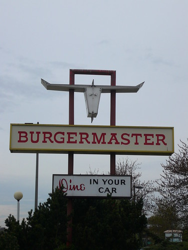
To wit: the Kirkland Art Center is currently hosting False Proof, a group show curated by Cable Griffith, featuring Drew Christie and several other artists "creating work that exploits the bubbles we preserve between knowing and not knowing." Gonna have to go check it out. Might stop at Burgermaster on the way back.

False Proof is up through October 3rd. Get more info and directions at kirklandartscenter.org, and check out Drew's blog, Democracy for the Cartoons, for more images.

Your Weekly Mr. Littlejeans

.
Mr. Littlejeans in the year 2000

As I think I've explained a few times (just click "cats" below and scroll down until your head explodes), we originally got Littlejeans because Emily needed some company while she was in law school – we had this incredibly dark apartment in Hell's Kitchen and she was stuck studying during all hours of the day and night. Now Em is preparing to go back to school and I'm sure Jeans will resume his duties. Best companion animal ever.

Thursday, September 24, 2009

Need vs. Want

.
This one is so clearly a Want. I mean, really, (a) where would I ever wear it? and (b) how could I ever justify it? But if I could, I would:

Contrast Jersey Gown by Gianfranco Ferre,
$1,098 (marked down from $3,440), Gilt.com
(if you're not already a Gilt member, click here to join –
although this item is a little outlandish,
the site has some incredible, affordable steals).

Top Chef

.
Raekwon the chef is back with his fourth album and he serves us up something marvelous. This album takes me back to the days when I used to memorize lyrics for entire albums, taking my walkman or CD player everywhere I went. It makes me nostalgic for late nights in New York watching The Bridge, Ralph McDaniels' video and hip-hop culture show on NYC TV, which was the last time I saw Raekwon. He was back from a trip to Africa, just having played a show in Sierra Leone, wearing a dashiki and dropping jems about Blood Diamonds, among other things. And it makes me realize that after 14 years and some inconsistent releases in between, it's possible for artists to find their voice again. This album is a return to form for Raekwon, referencing back to his classic, first album of the same name. Remember Incarcerated Scarfaces? Remember Ice Cream?! With production by top-tier pro-tools pros RZA, Dr. Dre, J Dilla, Pete Rock, Marley Marl(!), Erick Sermon(!!), Alchemist and Allah Mathematics among others, there is some real strong musical material here.

Raekwon says that he was lucky enough to hook up with Dilla before he passed away, and together they made some of the more killer tracks on this album. Old School legend Marley Marl flips the JJ Band sample that Lord Finesse flipped (and OC killed) many years ago. Dre does his best East Coast style. And for the last song on the album, Lou Diamonds interpolates "Goodbye Yellow Brick Road" to take us home. Lyrically, Rae, the ever-present Ghostface, and extended family like Beanie Siegel spend most of their time building narratives about pushing drugs, comparing themsleves to lobster, calamari and rigatone' and generally spitting something nasty, all while extending the beauty of metaphor and language.

22 tracks of super solid gold.

Now go out and buy the album.

Image of the Day

Dan Attoe Everybody is Out Fuckin Around, 2009 (Oil on Panel, 5 x 7 inches), from the show I'm done worryin' about shit., on view through November 15th at Peres Projects in Los Angeles. Dan Attoe is from Bremerton-WA ("A rough, small Pacific Northwest town" –Artforum) and currently lives and works in Portland, Oregon.

More info and images at peresprojects.com.

I Just Wait Until Something Strikes Me

.

An excerpt from Portrait of Imogen, a 1987 documentary on the Northwest-born photographer Imogen Cunningham (1883–1976). The Seattle Art Museum currently has 60 of Cunningham's photographs on display in the third floor galleries, and G. Gibson Gallery has a selection of signed prints for sale. Here's one:

Imogen Cunningham, People in Their Places, No. 5,
1958, gelatin silver print, signed, available from G. Gibson Gallery, Seattle


[ Info via Jen Graves at SLOG
and Regina Hackett at Another Bouncing Ball ]

Wednesday, September 23, 2009

Image of the Day

.
Mary Katrantzou, Spring 2010 RTW (click to enlarge)

American Couture

.
Alek Wek wearing an Isabel Toledo design for a Nordstrom
advertisement in Harper's Bazaar, June 2009


We saw some good shows while we were in New York at the beginning of the month (Richard Avedon at ICP, a terrific show of works on paper at MoMA - more on that later), but among the most inspiring to me was the Isabel Toledo exhibition at the F.I.T. museum, Fashion from the Inside Out, which closes this weekend. If you're in NYC between now and Saturday and haven't seen it yet, I highly recommend a viewing.

Isabel Toledo at F.I.T. Photo by Patrick McMullen, via WSJ.com

Toledo is a Cuban-born designer who held her first show in 1985, and who shot to national prominence in January when Michelle Obama stepped out in her dress and coat on Inauguration Day. Toledo's design process involves a collaboration with her husband, Ruben, who sketches her designs on paper as Isabel conceives them.

Illustration for Tequila Sunrise dress by Ruben Toledo.
Image
via The Museum at F.I.T.

Isabel and Ruben Toledo in their flower district loft.
Photo by Max Vadukul for The New Yorker

The show is organized around several different themes, with the designs selected for each part of the show ("Liquid Architecture," "Manipulated Surfaces," "Origami," etc.) emphasizing a different aspect of Toledo's creative aesthetic. Many garments are displayed along with a graphic rendering of the pattern pieces that enables you to see (if you have the necessary spatial reasoning skills, at least – I do not) how Toledo's often ingeniously simple cuts create their complex sculptural shapes as the fabric drapes on the body.

Packing dresses, Spring/Summer 1988.
Photo by Karen L. Willis, via
The Museum at F.I.T.

Tube jacket, Spring/Summer 1995.
Photo by William Palmer,
via The Museum at F.I.T.

Harness dresses, Spring/Summer 2003.
Photo via
jameswagner.com


Denim Pie coat, Spring/Summer 1995.
Photo by William Palmer,
via The Museum at F.I.T.

I was struck by the originality of Toledo's vision – many of these designs look like nothing else I can call to mind. And there is a true sense of romance and preciousness (in a good way) about the clothes; the line, color, fabric, and often breathtaking details of each piece practically radiate the thought and care that has gone into their conception and execution. Toledo has said that she thinks of herself more as a "seamstress" than a designer, and her love and respect for the technique of sewing is clearly evident in her finished creations.

Cornflower dress, Fall/Winter 1998.

Waterfall dresses, Spring/Summer 2007.
Photos above by
William Palmer, via The Museum at F.I.T.

Broomstick Librarian shirtwaist dress designed for Anne Klein
Spring/Summer 2008; hand-painted by Ruben Toledo.
Photo via
jameswagner.com


Beyond the sheer beauty of the clothes, though, I was most impressed by the timeless quality of Toledo's work. The garments in the show represent the full span of Toledo's career, but – with the exception of a few dresses from the 90s that betray a kind of Tom Ford influence – Toledo has clearly never been about chasing trends, and I would be hard-pressed to date most of the designs: they manage to appear at once sweetly old-fashioned and fashion-forward. With the Bryant Park shows following fast on the heels of our visit, it was a lovely way to start the Fall fashion season.

Hermaphrodite dress, ca. 2005.

Felted Pie coat with Arc pockets, Fall/Winter 1995.
Photos above by William Palmer, via The Museum at F.I.T.

Fashion from the Inside Out runs through Sept. 26 at The Museum at F.I.T. (admission is free; more info here). You can watch a short clip of Toledo discussing the exhibition and her work with New York's Harriet Mays Powell below, and a 2008 article about Isabel and Ruben can be found at The New Yorker website, here.


***
Related:

Ruben Toledo adds his fanciful sensibility to covers for the
recently released Penguin Classics Deluxe Editions of (from top)

The Scarlett Letter,
Wuthering Heights, and Pride and Prejudice.

Tuesday, September 22, 2009

A Single Man

.

Tom Ford's directorial debut is based on the 1964 novel by Christopher Isherwood about a gay British professor in 1960s Los Angeles who is still devastated by the death of his partner several years earlier. Ford says the movie is "not about being gay… it’s really a film about love and isolation that I think all of us feel so it is very universal. When I see someone who sees the film who say’s 'it's a gay story,' I don’t even know what they are thinking, it just seems to me a human story." A Single Man was very well received when it was shown at the Venice Film Festival a few weeks ago, and the film's star, Colin Firth, won the festival's award for best actor.

A Spring 2000 issue of Fashion of the Times (the pre-T fashion supplement to the Sunday NYT) had a feature on the film inspirations of various fashion designers, including Tom Ford, who was then at the helm of both Gucci and Yves Saint Laurent. Click to enlarge:

I'm not sure I see the movies he lists exactly influencing what's shown in the trailer, but there is no doubt Ford is adept at creating an extremely rich visual environment, and in addition to the story itself sounding interesting, I'm excited to see A Single Man just to look at it.

Normally I would put a link here where you could go for more info, but oddly enough there's not too much official information about the film on the web yet, other than the trailer and from other blogs. Anyway, there it is, stay tuned for more info as I'm sure we'll post about A Single Man again.

While we're at it, here's the rest of that feature from the New York Times:

[Ghesquiére with the win]

Rhymes with Steez

.
Hey guess what? Our good friend and a Seattle native Katie Constans is now the New York editor of this skate magazine called Sneeze. The cover story features Valentina Zelyaeva shot by Robert Nethery.

Order it up at sneezemag.com and see more of Katie's work at her website.

Image of the Day

.
Tauba Auerbach, Crumple VII, 2009 Acrylic and inkjet on canvas, 96 x 128 inches, at Deitch Projects, NYC. The crumples are not wrinkles in the canvas – she has painted the dots in a way that makes it look that way. Standing in front of it made me feel like I'd been smoking drugs.

The main thing in the exhibit is actually the Auerglass, a custom made two-person pipe organ, which Auerbach plays with Cameron Mesirow, aka Glasser:


Visit
taubaauerbach.com and deitch.com for more info and pics. Tauba Auerbach HERE AND NOW/AND NOWHERE is up through October 17th.